
Customizing Your Widget
Make it yours. The whole point of a live chat widget is that it feels like your site, not like you bolted on someone else's product. Everything here is configurable from the dashboard portal. Tweak the options in your embed snippet, or save your look as a workspace default and every widget in that workspace inherits it automatically.
Configuration options
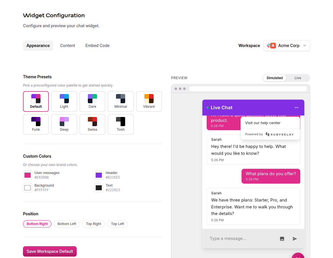
The portal gives you three tabs for tuning your widget. Appearance is where the visual work happens. Pick a theme preset, fine-tune individual colors with a visual picker, and drop the launcher into whichever corner of the screen makes sense. Content handles the visitor-facing copy, like the header title and welcome message. Embed Code shows the exact snippet you'd paste into your site, and it's fully editable too (more on that below).
Every change in Appearance or Content renders instantly in the live preview next to the controls, so you can nail the whole look without deploying anything. Both install methods (script tag and npm package) accept the same set of options. Here's the full catalog:
| Option | Type | Default | Description |
|---|---|---|---|
apiKey | string | - | Required. Your workspace API key, from the Widget Configuration Embed Code tab. |
channel | string | - | Route this widget to a specific channel by its channel alias (e.g. compass-panda-block). Defaults to your workspace's default channel. |
clientID | string | - | Identify the current user across sessions. |
clientEmail | string | - | Identify the current user across sessions by their email address. |
widgetSignature | string | - | A signed identity token from your backend that lets returning visitors load their saved conversation history. See Identity Verification. |
page | string | window.location.href | Tag conversations with the page the visitor is on. |
position | "bottom-right" | "bottom-left" | "top-right" | "top-left" | "bottom-right" | Where the chat bubble appears on screen. |
welcomeMessage | string | "Start a conversation!" | Greeting shown in an empty chat window. |
headerTitle | string | "Live Chat" | Title shown at the top of the chat window. |
debug | boolean | false | Log widget events to the browser console. |
showSenderNames | boolean | true | Show team member names in the chat. |
defaultOpen | boolean | false | Open the chat window automatically on load. |
customLink | url | - | Add a link to the chat header (e.g., your help docs). |
theme | object | - | Theme configuration object (see below). |
Theme options
The theme option accepts an object with a preset and optional color overrides:
| Option | Type | Default | Description |
|---|---|---|---|
theme.preset | string | "default" | One of: default, light, dark, minimal, vibrant, funk, deep, swiss, tosh. |
theme.userMessageColor | string (hex) | preset default | Background color of the visitor's message bubbles. |
theme.chatBackgroundColor | string (hex) | preset default | Background color of the chat window. |
theme.textColor | string (hex) | preset default | Primary text color in the chat window. |
theme.headerColor | string (hex) | preset default | Background color of the chat header. |
Theme presets
We ship 9 themes so you can pick a vibe and go. Each one sets the full color palette for the header, background, text, and message bubbles:
- default - Purple and pink on white. The flagship palette, works with almost anything.
- light - Indigo and sky blue. Cool tones, easy on the eyes.
- dark - Purple and emerald on dark navy. Built for dark-mode sites.
- minimal - All grays, start to finish. Disappears into any design.
- vibrant - Amber and red on warm cream. Loud, warm, unapologetic.
- funk - Deep purple on clean white. Bold and high-contrast.
- deep - Pink and lavender on charcoal. Moody in a good way.
- swiss - Rust and red on off-white. Warm, editorial, grounded.
- tosh - Monochrome gray and black. Quietly confident, zero flash.
Custom colors
Every theme can be overridden with your own brand colors. Dial them in visually on the dashboard, then grab the generated snippet from the Embed Code tab:
window.RubyRelayWidget.init({apiKey: "YOUR_API_KEY",theme: {preset: "minimal",userMessageColor: "#E02D8B", // visitor message bubbleschatBackgroundColor: "#FAFAFA", // chat window backgroundtextColor: "#1A1A1A", // message textheaderColor: "#2D1B69", // chat header background},});
Pick a preset as your starting point, then override individual colors to match your brand. The preset handles everything you don't override.
Widget position
Four options: bottom-right (default), bottom-left, top-right, or top-left. Pick one in the dashboard, copy the embed snippet, done:
window.RubyRelayWidget.init({apiKey: "YOUR_API_KEY",position: "bottom-left",});
The widget automatically avoids overlapping with common UI patterns like cookie banners and scroll-to-top buttons. If you still see overlap, try adjusting the widget position to avoid the conflict.
Content customization
Control the copy your visitors see:
| Setting | Default | What it controls |
|---|---|---|
headerTitle | "Live Chat" | Title at the top of the open chat window |
welcomeMessage | "Start a conversation!" | Greeting shown in an empty chat window |
showSenderNames | true | Whether team member names appear next to replies |
customLink | none | Adds a link in the header (e.g., to your FAQ or docs). Pass a valid URL. |
All of these are editable from the Content tab in your widget settings. Changes update instantly in the live preview, so you can dial in the perfect look before updating your site.
Live preview
The portal shows a live preview of your widget right next to the config panel. Adjust a color, watch it change. Toggle a theme, watch the whole thing shift. It's the fastest way to nail your look without deploying anything.
Use the Simulated / Live toggle above the preview to switch between a demo conversation (great for checking colors quickly) and a fully connected widget that actually sends and receives messages through your Slack channel. Test the entire experience without leaving the dashboard.
Saving workspace defaults
Happy with the look? Hit Save Workspace Default at the bottom of the Appearance or Content tab. That saves your styling as the default for every widget in the selected workspace. No code changes, no redeploy. Widgets pick up the new look on their next connection.
Defaults are saved per workspace. If you run more than one, switch between them with the workspace selector at the top of the page, and each keeps its own saved look.
Options set directly in your embed code always win. Saved defaults cover everything you don't override, so you can lock in a workspace-wide baseline and still customize individual pages when you need to.
Grab your embed code
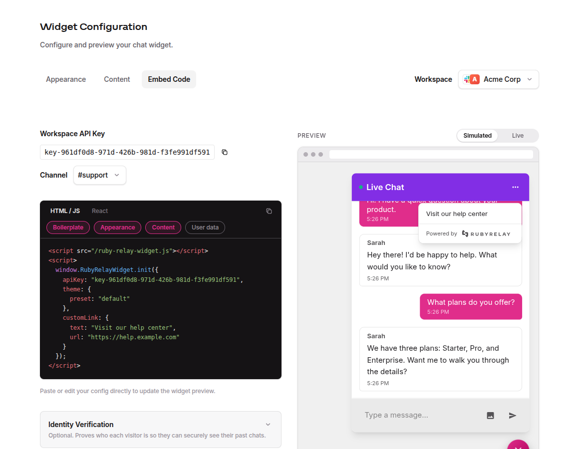
The Embed Code tab is the snippet you copy and paste into your site. It's fully editable too, so you can hand-tune a color or drop in an existing config without leaving the dashboard.
Prefer just the config object? Click the Boilerplate chip above the snippet to hide the <script> wrapper, and toggle it back on before you copy the whole thing. Mistype something and Ruby Relay flags it inline, syntax errors, unknown options, bad value types, or an API key that doesn't match a workspace, each with a short note so you can fix it on the spot.
When it looks right, copy it straight into your site, or hit Save Workspace Default to make it the baseline for every widget in the workspace (more on that above).
Remove Ruby Relay branding
By default, the chat widget quietly credits us with a small "Powered by Ruby Relay" line in the header menu. It's subtle, but it's there. White-label mode hides it entirely, so the widget reads as a fully native part of your site. No attribution, no menu footprint, no giveaway that you're running someone else's product under the hood.
To turn it on:
- Head to Billing in the dashboard sidebar.
- Find the Plan section near the top of the page.
- Flip the White Labeling toggle on. That's it.
The change takes effect immediately. No code to update, no redeploy, no stale browser cache to bust. Every widget across every channel picks up the branding-free look on its next connection, because white-label is an org-level setting rather than a per-channel one. Flip it once, and your whole footprint goes quiet about us.
Plan required. White-labeling is available on the Growth and Scale plans. On Starter, the toggle is disabled and you'll see an upgrade prompt next to it. See Account & Billing for plan details and how to upgrade.